The making of the cover for Röda dagars hämnd

Earlier this week the cover for Stefan Hagel’s third book, Röda dagars hämnd (freely translated: Red Days’ Revenge), was released so I thought I’d share how the book cover was created.
Step 1: What does the author want?
Stefan had some specific things that he wanted on this cover. The most important things were that the font should be red and the cover should include a beheaded stag. If possible there should also be some sort of allusion to a wolf somewhere.
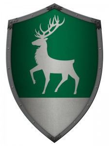
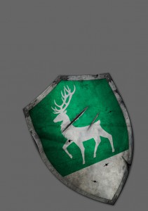
After some discussions we settled on the use of a shield in emerald green and silver with the family Teraphen’s coat of arms (a stag) on it.
Step: Research
Research is important to me because I don’t want to make stupid or obvious mistakes just because I don’t know enough about something. This cover required a heraldic shield so I exercised some google-fu on the subject until I felt confident about designing a shield.
Step 3: Sketching
This stage is very personal. I do most of my “sketching” in my head and then I draw something (sloppy) on paper just to remind myself what the image in my head looks like. I never show my rough sketches to anyone – they’re too ugly – but when I have the sketch ready I move on to my digital toolbox.
Step 4: Vectorize
As stated above, I’m a sloppy sketcher on real paper so when I want really nice and clean lines I turn to Illustrator and draw the things I want with vectors. I really like working that way because I can pick things apart and move them around, ad and remove, make things smaller or bigger, without risking any kind of quality loss.
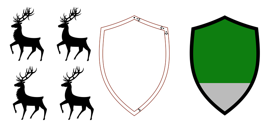
First I designed the silhouette of the stag and as you can see I made some variations to choose from. Then I created the bits and pieces for the shield.
Step 5: The building phase
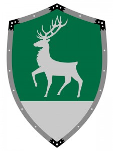
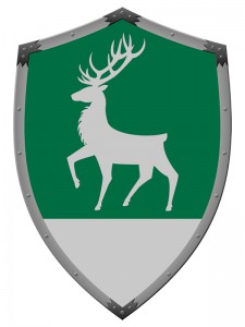
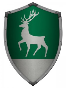
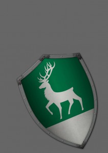
Time to put all the pieces together in Photoshop and make them look like something more than just flat colours. I work with brushes, textures and layer effects to get the results I’m after.
The style I use on Stefan’s books is supposed to look semi real – half photo, half something else, so I try my best to fake 3D effects.
Step 6: Positioning and perspective
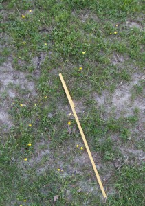
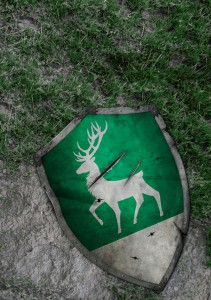
When the shield was transferred to the would-be cover I had to do some more research to figure out what the background should look like. I knew how big the shield was supposed to be and how big a wolf’s paw print is, so I took a folding rule, a step ladder and my camera and visited a nearby paddock to get a good picture of how grass and mud look like from the point of view I had in mind. (Inevitably every single neighbour in the area seemed to be out right at that moment so they could wonder what the heck I was doing on a step ladder among the horses.)
Step 7: Distort and destroy!
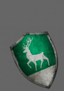
As with Stefan’s previous two books there comes a point when I must take the object I’ve created and more or less demolish it to make it fit the cover. The shield should look like it had been through a serious battle.
Damages were painted in with more textures and shadows alongside holes from arrows or spears. Then some long slashes, possibly from an axe, to behead the stag = destruction complete!
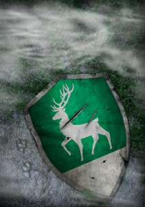
Step 8: Pimp the background with details
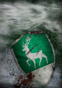
Grass, mud and wolf tracks were added with a variety of methods – I mix and match textures from my own photos with brush work until I’m content. The blood splatter was the last detail that was added because I wanted something that could stand out against the green and grey.
Step 9: Finally the font
This is the third book in En saga om sorg so I already have a font and fixed layout to work with, which is good, but sometimes the standard letters just aren’t good enough so I have to edit them a little. The R got a makeover because it was broken and too fat. I wanted it to look more tall and regal.
The colours were tricky. Stefan wanted red letters so I had to search for the right shade of red to make the cover work. (It wasn’t easy.) I finally ended up with a mixture of hues, one really bright red at the top and then something more greyish at the bottom, that I think works well.
Step 10: Add the spine and back
A new book cover is born!



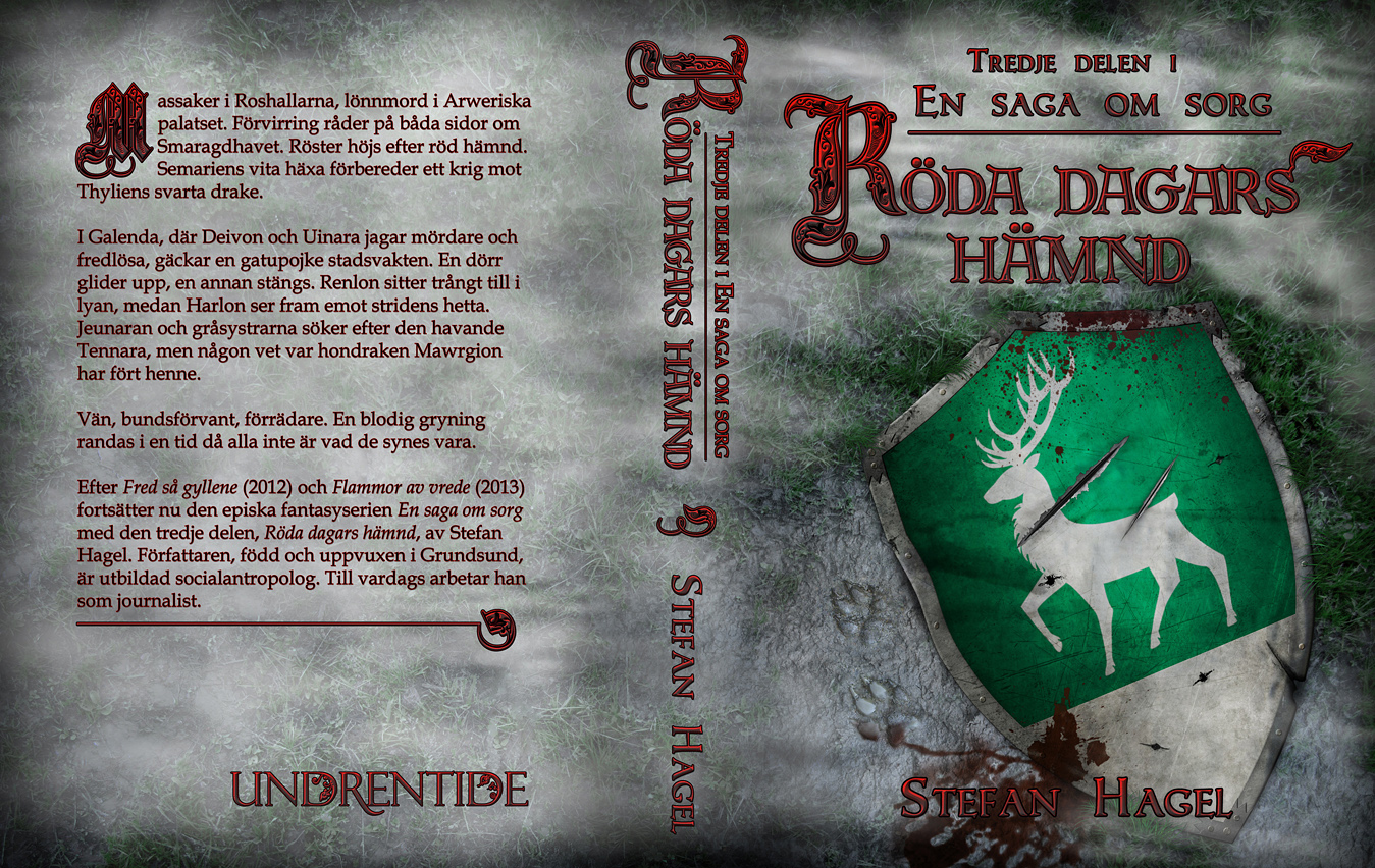
[…] Ni vet också att jag är supernöjd med hennes arbete, som kräver skicklighet, kreativitet och talang. Här berättar hon hur processen att skapa Röda dagars hämnd-omslaget gick till, steg för steg. […]